UK at a glance
Another year of NSE complete (apart from Summer); more stats, graphs and pretty pictures to look at.
→ Interactive Map for BUEC Points ←
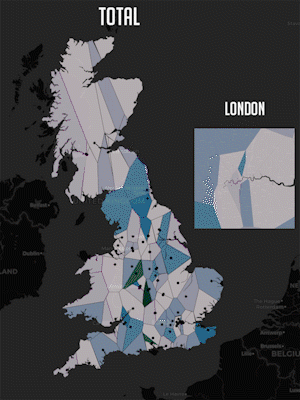
The animated map above should give you a peek into how different areas of the UK perform in each game. From it you can see a pretty common pattern between the two types of games; Team and Individual.
The team games (League, CS, Overwatch...) tend to follow a similar pattern of; Midlands and London dominance, with the occasional outskirts university doing well. This pattern follows pretty closely with which universities have the most established esports societies.
The Individual games (Smash, Tekken…) had a much more random spread of good universities. As the performance depends less on the quality of an esports society, but instead pot luck of who ends up going there.
Points Table at a Glance

This is the ‘Blame and Shame’ graph which you can screenshot and send to the other games in your societies to blame them for letting the uni down.
The relationship between Team and Individual games can also be seen here. The team games correlate much closer with the total score, reflecting how a better esports society will do better in both the team games and overall.
But this also shows how lacking the big societies have been in games like FIFA, Smash & PUBG. These games should be free points but the societies aren’t managing to support them.
Points per Student

The biggest factor that makes up a good esports society, is the size of the university. A large player pool to pick from just gives your more players for more teams and a better chance at getting good players.
Having said that, the University of Abertay Dundee is able to punch well above its weight, with a student population of less than 5,000. This is due to the Uni offering Computer Games Courses, so their Gamer Population Density (GPD) is going to be really high. Same story for the other higher performing universities listed on the graph.
The University Campus of Football Business (UCFB) wasn’t included on this graph as I was unable to track down accurate numbers for their students. However, I have no doubt they would be number 1 in points per student.
Who plays what

In the chord diagram above, each line represents a player. A line connecting two Games represents a player being on a roster for both games. This diagram shows that the overwhelming majority of players only play a single game. Interestingly, the majority of smash players play more than one game, with 1/3rd of smash players also on a league of legends team.

If we replot the diagram with just players who play more than two games, you can see the crossover much easier. CS:GO seems to have the most flexible players, playing the most in all other games except smash. While I have no evidence to back it up, I’m guessing these are the same people that are self-proclaimed Valorant pros.
Sources
Interactive Map and all Images
Interactive Map
Google Drive
Data
BUEC Points Table
Number of Students at Each Uni
UK Map Data
Tools
Python
Shapely
Geovoronoi
Folium
Holoviews
Seaborn
Any questions @RiceyBeMe#8285 on discord!


